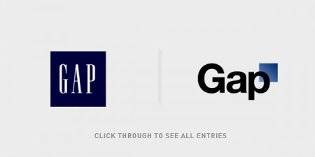
Scott Hansen at the iso50 blog had a Gap logo redesign contest
I kept seeing mention that people liked the "old" logo better. But I never heard anyone mention the original logo.
I dug up a photo and copied it.
Subscribe to:
Post Comments (Atom)


2 comments:
What's your stance on the new logo? I read that they've just completely reverted it instead of whatever crowd-sourcing shenanigans they were trying to pull a few days ago. Of the three logos I think the original was the best, but I identify with the blue square serif text one as I don't think I was around when the original one was.
I used to love all the old "Fall Into The Gap" commercials.
http://www.youtube.com/watch?v=CCEBoOy0ne8
Post a Comment