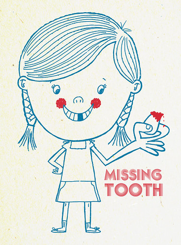
I like the color choice for the first version, very simple yet darling! (Little icky with the blood though!) :) Both are good. I do like the retro feel in the first one. Great work on both!
Oh, I'd definitely go with the top one. The early century limited palette mixed with the bloody (is that a chunk of gum?) is brilliantly subversive. Very cool.


17 comments:
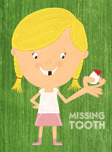
This is so cute! I prefer the first version.
that is the coolest entry i've seen yet. i vote for the limited colour version.
ha, that's pretty, erm, sick. i like the limited palette too.
I like them both:-)
I like your zany drawing style.
Those are cute!!i love version 1 more, it look like an old style poster!!*u*!!
this rocks. :) my vote is for the limited palette.
It's so cute!!
I like both of them!!
I keep seeing things in each of them that I appreciate that the other doesn't have, so no choosing for me or...I choose them both (like marion)!
cool!
definitely my favourite this week. i like the first one, i think the texture on the background really makes it.
I like the color choice for the first version, very simple yet darling! (Little icky with the blood though!) :) Both are good. I do like the retro feel in the first one. Great work on both!
Hey, let's face it. Childhood can be very bloody! I love your retro style as well.
Oh, I'd definitely go with the top one. The early century limited palette mixed with the bloody (is that a chunk of gum?) is brilliantly subversive. Very cool.
WOW I am so linking to you!! Thanks for stopping by Monday Artday too!
I LOVE THIS! I think the blood on the tooth is my favorite part :-)
cool. I love your style.
if you have time
http://storyteller-wonder.blogspot.com
Very cool, cute and retro all at once!
Post a Comment