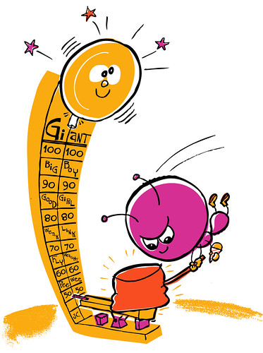
For some reason when I heard the theme was "might," the first thing I thought of was how you always hear how ants can lift 10 times their body weight. In my quick internets research, I found out ants strength is overstated, but I already had my idea.
I wanted to experiment with limited color here. I was inspired by some colors in an old 60s letter/bill holder that I have. I also was inspired by some old cookbooks I have, that use just black and one color. I like how they use the solid color to describe the shapes, and then use interior black for details.
Here is a pic of the bill holder that inspired the color. Click it for the larger size and some other close-ups on my flickr too:


39 comments:
Wow! Mighty ant! Love your illo, John!
Wonderful thought process for this piece. Love the color decision for the graphic look.
love the colors together! this is really fun and retro!
Ah...if ants aren't that mighty, you should've made the ant unable to ring the bell. Still a great illo.
I love the retro colors and the subject is great!!
I'm fond of the flat illo as well.
You have dispelled an urban myth!
I like the flat coloured one better too. Nice work.
awesome, love the style for tru is a n original retro style
lovely idea and a cool illo.
great job! I think I agree with you... the flat version has a better feel to it.
cool idea!
your illustration is fresh and excellent. it stands out even more after reading your description. very well done!
Awesome! i love it!
I think you may be really proud of your experiment :)
John, your work is great. You might know this blog already, but have you been to http://modmom.blogspot.com/ ?
I think you might like it.
thanks for the comment! ace, another ant-thinker! have fun!
AWESOME take on the theme!! Love the design too!
lovely colors. luv it!
Awesome illo John! The big head on the ant is super and I love the rankings on the strength test. He-he big boy!!
why do you insist on ruining everything with your "internet research"? Next you'll tell me beetles aren't endopterygotes with complete metamorphosis'.
<3jeannette
www.jimmyjanesays.com
jeje, great idea and unbetable interpretation!
saludos!
Nice colours, great idea and like the style too : )
very distinct style and very clean!
wonderful! mighty indeed!
I LOVE IT!! Great time to experiment with colors...absolutely worked well..
wonderful idea and I like the limited colour palatte!
What a cute character, and I like your bright and fun colors.
Anette
www.wynlen.no
cool character. I like the movement!
Great piece - I like the texture throughout, it definitely gives it that retro feel.
Perfect sixties aura! Bravo!
I agree with all! Great.
Great use of color!
mighty nice!
great illustration! i love the action on this one... and great experimentation with a new style :)
el oh el. i LOVE his face!!
Made me smile! I can feel the action/movement. Love it.
hey john..thanks for the comment...
i meant to ask you...could you post a link to that old bill/envelope holder? i'd love to see your colour reference materials...
You've got a lot of great work on your blog! I like the fun, retro styling and bright colors.
i love your "throwback style"! There's so much energy in this piece that the limited color usage really elevates the actions! Terrific as always!
Cheers,
Theresa
John your blog rocks! Awesome work! Your racoon is freakin cool. I love the retro hipness of your stuff. I am way jealous of your skills.
Post a Comment