
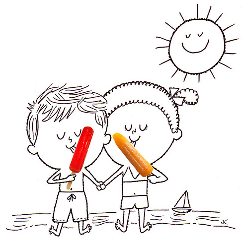
In 1905, the Popsicle was invented by an 11 year-old Frank Epperson. He had left his fruit flavored soda outside on the porch with a stir stick in it. The drink froze overnight, and the next morning he discovered the frozen treat. He originally called it the "Epsicle" (no relation to the Epilady), which his children later re-named to the more palatable "Popsicle."
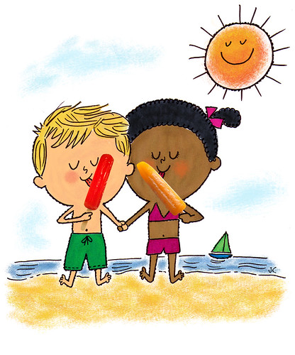
For this illustration, I was inspired by some old kids' cookbook illustrations, that were just line art and photographic items (like cakes, ice cream cones etc. If i can find them again, i'll put up a link or post them.) I ended up doing a color version too. I like the line art one better, but I figured I'd post both. Tell me which one you like better.


43 comments:
Hi,
I like the line drawing better. No colours to make the popsicle stand out. What an invention!
Yum, I like orange Epsicles the best.
I really like the line drawing version too. It has a fun, simple feeling to it.
I prefer the line version. Looks like a 70ies ad, very sweet, somehow retro. Good idea!
Both versions look great but for showing off the popsicles the line version is better. The kids look so adorable.
Line drawing works best for me as well, and the popsicles make me feel cold!!! Brrrrr. Fun illo and facts!
Its time someone told you...I really like how you draw hair.
Hi,
i'm love your illustration. I prefer the line drawing, retro and clear. I love this mix : drawing and photo. Wonderful !
Fun illo! ...and I agree, the line drawing makes the popsicles... well, POP!
These characters are too cute! Their charming little faces really come to life with those bright popsicles! The line art is definitely the better composition of the two! Splendiferous work!
Really sharp and clean work!
terrific!
Super Sweeet John!!!
I like this poster!
I want it!!!
Cool and refreshing! I love the black and white because it emphasizes your great quirky bumpy line work!
They are so adorable. I love old kids cook book illustrations too.
wow, super illo!
Best Wishes,
Issi
great invention...love it!!
These are both great. I suppose I like the to one best...
Great illo. I love it!
this is so cute! i must agree with everyone else! love the line version! I can see it in a magazine ad!
OH BOY!! THis is tooo CUTE!! NOW I want a popsicle too!!
Ahhhh, cute!! As usual, I love you style!!
sweeeet!;)
Sweet invention pick! I like the B&W line art the most because of the wonderful contrast with the Epsicles. Love those crazy toes!
AH THIS MAKES ME WANT A POPSICLE SOOO BADLY! i would definitely pick the orange one over any other color...but my second pick would be red. YOU DID GOOD!
I second Liz on the color choices. Excellent. I like 'em both. Besides retro ads it reminds me of a cartoon that I cant think of and I'm not going to be able to sleep until I figure it out. If I scroll your page up and down really fast it starts coming to me.
I think it's Dexter's Labratory actually. Weird, I thought it would be a cartoon from my childhood, not a cartoon from my late-teenage-i-shouldnt-love-cartoons-anymore-years.
Great!
jeje, John this is very good, great!
súper chulo!
Hi John. thanks for stopping by! Love your work! a big fan!
hahah so awesome!! great work
Popsicles sound good now...always love your work, the retro feel, colors, and your characters.
Fabulous! I like the top one better. Be cool with just a few snips of the tones from the popsicles, pulled back to like 40% and on the swim trunks but excellent as is! Thanks for the heads-up on my deffective link.
Very fun!
Coool-- like/lick 'em both-- the color one hit me first- but on second look, think they're equally tasty in their own ways.
OH my! I sure wish this was my illustration!! I love it madly!
My vote goes for the line art version too.
They're both great, but I'd second the line art comments - it has a great retro feel. The idea of adding photographs is neat too.
Love it! The actual popsicles with the illustration really makes it that much better. Love the style!
Fun! It's very cool.
Anette
www.wynlen.no
John, Your work is amazing! I love the characters you create and the simplicity with which they are presented.
hola john! realmente me gusta tu trabajo! acabo de conocerte a partir de un comentario tuyo en mi blog. muchas gracias por visitarme, yo lo haré seguido en el tuyo!
The line art one is great. Simple and effective.
hi like popsciles
No doubt really attractive design, shaking hands looks pretty good :)
Thanks
Post a Comment